Follow Me on Pinterest

Saturday, October 29, 2011

Aesthetics in the Classroom - Does Art Have to be Beautiful?

Student A - Happy 

My students and I have been entertaining the question "Does art have to be beautiful?"  I have been observing their reactions to art they don't like (it's boring or dumb).  It's not just that they are responding to the visual, but also to the meaning and emotions that are in an artist's work.  I wondered if they were able to connect to their emotions and feelings in the art they made, perhaps they could relate to the feelings of other artists.  I came up with an activity that really seems to have connected my young artists with their own feelings expressed through their art.

I asked my Art I students to create two artworks: one representing happy emotions and one sad emotions.  We used oil pastels as a quick, expressive material.  I asked them not to draw something recognizable, but to try to draw what their emotions might look like.  Then I asked them to answer four questions about their drawing.  I selected these four (out of over sixty 9th & 10th grade students) for their artistic expression and their responses.  

Here are Student A's responses:
  • Does your art have to be beautiful to be meaningful to you?
    • Your heart doesn't have to be beautiful to be meaningful to you just as life doesn't have to be great to have importance.
  • Do you think your art reflects your emotions successfully?
    • I think the first picture reflects my feelings better because it's more expressive of life as a whole.  
  • Which work do you like the best and why do you like it the best?
    • The second picture is too true to be true.  Being average humans, we don't usually go a day without expressing griefs and sadness, making it more real.
  • Do you think making art in this way could help you deal with emotions?
    • I think I can reflect my emotions through art successfully and organically, but when we get assignments that I can't relate to, it's harder to do so.  This can help with emotions for sure.


Student A - Sad

(NOTE to teacher self:  try to make all assignments engaging to all students!  Is this possible?)


Student B - Happy
Student B's responses:
  • Does your art have to be beautiful to be meaningful to you?
    • No, just as long as you think it's beautiful, it doesn't matter
  • Do you think your art reflects your emotions successfully?
    • Yes, I think it does.
  • Which work do you like the best and why do you like it the best?
    • The bad drawing because when I'm mad there are storms going on.
  • Do you think making art in this way could help you deal with emotions?
    • Yes, because you can color different types of ways.


Student B - Sad

(Is it possible by connecting to their emotions in making, that they might be able to extrapolate to other artist's emotions?)

Student C - Happy
Student C's responses:

  • Does your art have to be beautiful to be meaningful to you?
    • No, it does not - it can be ugly and still mean something.
  • Do you think your art reflects your emotions successfully?
    • My art does reflect my emotion.
  • Which work do you like the best and why do you like it best?
    • The sad one cause that's how I am in the inside.
  • Do you think making art in this way could help you deal with emotions?
    • Yes, it would help me a lot.


Student C - Sad

Student D - Happy
Student D's responses:

  • Does your art have to be beautiful to be meaningful to you?
    • No, it just has to mean what you feel, no matter what it looks like.
  • Do you think your art reflects your emotions successfully?
    • Yes, because when I think of sad, I think of grey, black and red.  I think these emotionless colors mean pain.  When I think of happy feelings, I think of vibrant colors that pop out.  I think blue, yellow and green means happy and light pink is peaceful.
  • Which work do you like the best and why do you like it best?
    • I like the sad one because it might be simple, but when I look at that one I feel empty and sad, which is the way I intended it to be.
  • Do you think making art in this way could help you deal with emotions?
    • Yes, I do; it gives you a way to express your feelings in a good, positive way.


Student D - Sad

This activity, which helped to connect them to their feelings seemed worthwhile.  Elliot Eisner says:
"The distinction between feeling and knowing is deeply ingrained in Western culture.  It is also deeply rooted in our educational culture.  Relatively few theoreticians dealing with epistemological issues in education underscore the importance of feeling as a way of knowing." (Eisner, p. 115)
The arts are a perfect place to reconnect our students with their feelings.  As they reflect on their own emotions and use those emotions to create, my beginning art students hopefully are starting to understand (know) that those feelings are a powerful place to tap into for their creative expression.  Perhaps through connecting with their own feelings, they will begin to recognize other artists' emotional messages in art and be more open when considering art they may not like.

This exercise works on another level as well, because I want my art students to come away from their art class ( because it is possibly the ONLY art class they will ever take) with the understanding that art can heal the viewer as well as the maker.  Having an outlet of expression, like art, to mediate between the physical and emotional can be of benefit to them in the future.  The creative and expressive experience is ingrained in us, and sometimes we just need to know how to tap into that power.
Imagery is a function of the right side of the brain.  Every experience we have and the emotions that accompany it are perceived by the body and the right brain as imagistic sensations.  Although any of the senses can produce an imagistic impression, visual imargery, which can be anything form a recognizable object to an abstract shape or color is usually (for sighted people) the strongest of these sensate impressions.  That is why when we feel angry, we often say we see red.  When we are sad, we may say we feel blue.  Or when we near the end of a difficult ordeal, we may say we finallly see a light at the end of the tunnel.  These are prime examples of the universal imagery we all share and associate with particular feelings or emotions.  (Ganim, p. 10)

So as maker or viewer, finding and relating to these universal images can be exciting and healing.  As I looked at my students' work, I was amazed at the variety of their expression.  Their images are visually diverse yet spring from a common place.  I'm going to hang this work up in the art room as an installation and we'll have a conversation about it.  It will be interesting to hear what they say.  I hope they are beginning to understand the power of art.


Resources:  
Eisner, E.E.  (1998) The kind of schools we need
Ganim, B. & Fox, S. ((1999) Visual journaling:  going deeper than words.


Friday, October 21, 2011

Aesthetics in the Classroom - Artist of the Day


I feel a bit like Dorothy in the Wizard of Oz this week...at the end when she wakes up in bed, surrounded by the ones she loves (who strangely look like the ones in her "dream") and she realizes everything she wanted was right there in her own back yard.  So it is with my Artist of the Day videos and the aesthetic experience.

I started Artist of the Day last spring semester as a result of divine inspiration - the idea just came to me, possibly the day before the second semester started: show a short video (under 5 minutes) of artists' work at the beginning of class each day.  Last semester I stabbed around, searching for interesting, dynamic videos that I thought would capture my students' attention and imagination.  I didn't use it as an instructional tool particularly, but was interested in finding out what they were interested in.  It was a hit.  Even students who were hard to engage would watch the videos, and I LOVED seeing them six times a day!

Fast forward to this semester.  I have launched into an effort to include more aesthetics activities in the classroom for my graduate semester project.  We have been reading Elliot Eisner in my coursework, and when I got to his essays about aesthetics, I stopped in my tracks.  I felt as though I had strayed away from teaching the students about aesthetics, that we were blazing down the trail of making art without stopping to consider nuance and meaning.  My last four posts have recapped beginning aesthetics activities:  liking, finding the words, asking 'is it art?' and ranking art.  This project has inspired me to create weekly themes for the videos, and not only was I hoping that my students were thinking more deeply about art, I was also taking Artist of the Day to a new level.

Last Friday I gave midterm exams and included a question about the Artist of the Day videos.  I wanted to find out what they were thinking about the videos.  What else might they be thinking beyond the activities we've been doing together the last month?  I gave them the beginning of 4 sentences to complete (they could choose two of the four to respond to):
  • The thing I like most about Artist of the Day is....
  • Artist of the Day helps me....
  • Artist of the Day is fun because....
  • I wish Artist of the Day was....
Their responses really surprised me - truly!  I don't think I realized that Artist of the Day was impacting them on such a deep level (hence the Dorothy analogy).  Aesthetics learning was happening and I didn't even know it!  Here are a few of their responses:

The thing I like most about Artist of the Day is....

  • it wakes me up
  • it makes me think of art in my everyday life
  • it gets my creative juices flowing and gives me inspiration
  • seeing how people can create magnificent stuff just from their imagination
  • it inspires me to have a more open mind
  • it encourages divergent thinking
  • it's relaxing and entertaining
Artist of the Day helps me....
  • learn something new
  • meet new artists 
  • open up the creative side of my mind to get ready for class
  • wind down from another class
  • analyze art better
  • challenge my ideas of what art is
  • become more cultured
  • find inspiration to further improve my artwork
  • by inspiring me to be a better artist
  • by giving me something to look forward to
Artist of the Day is fun because....
  • each day it shows divergent thinking
  • it expands my horizons
  • it gives me new ideas to make unusual art
  • I get to see the people in my class vote for the kind of art they like that week
  • it's a behind the scenes look at how an artist makes artwork
  • it shows that we are all unique through our methods, creations and differences
  • it gets me in the mood for art
  • it's the only thing that amazes me
  • it takes just a little time and helps you understand so much more about the world
I wish Artist of the Day was....
  • something we could talk about the whole period
  • more fun, more interactive, that we could try what the artists are doing
  • more interactive so students could tell the teacher what artist they like most and find a video on them
  • longer!
  • was ME
Wow!  Talk about a happy art teacher!!!  Very few of my 170 students had a disgruntled view of the videos.  Some thought that some of the videos were boring (I already knew this - they have a high need for excitement).  There are times I don't get it right - BORING, they tell me.  But that's OK, seeing a variety of work is what matters.  Pushing both our comfort zones has its rewards.

And, how Artist of the Day matters to them (and to me) leads me back to Eisner's ideas about art education (pgs. 97-99).  

I am interested in the contributions arts education makes to both the arts and to life beyond them.
1.  Arts education should enable students to understand that there is a connection between the content and form that the arts take and the culture and time in which the work was created.
2.  Arts education should refine the student's awareness of the aesthetic qualities in art and life.
3.  Students should acquire a feel for what it means to transform their ideas, images, and feelings into an art form.
4.  There should be a willingness to imagine possibilities that are not now, but which might become.  A desire to explore ambiguity, to be willing to forestall premature closure in pursing resolutions, and the ability to recognize and accept the multiple perspectives and resolutions that work in the arts celebrate.

I believe Artist of the Day hits the mark on all points, using a 5 to 10 minute activity to help them understand what's happening in art at the beginning of the 21st century, giving them opportunity to express their opinion, getting them inspired to practice more divergent thinking in their own art expression and opening them to the unbelievable variety and diversity of art being created and being shown on the Internet for anyone to see - here, now, relevant.  Artist of the Day rules!

Resources:
Eisner, E. E. (1998) The Kind of Schools We Need 

Saturday, October 15, 2011

Aesthetics in the Classroom - Ranking Art

 Mona Lisa, Leonardo da Vinci, 1503-1519, oil on poplar, 30 in x 21 in, Musée de Louvre, Paris

This week's aesthetic activity was object ranking from Marilyn G. Stewart's book, 'Thinking through Aesthetics'.  My students did this activity in small groups but each student had a form to record their individual opinion.  They looked at a collection of artworks and gave them a rank depending on how they valued each object.  Not only did they have to rank the art from 1 to 6, they also had to provide a reason for their determination.  I have a large art postcard collection and was able to make a like selection for each table grouping (typical images in this post):  1 master painting card (i.e. da Vinci, Michelangelo), 1 Zulu telephone basket card, 1 Van Gogh card, 1 Matisse card, 1 Ansel Adams card and 1 contemporary/minimalistic sculpture card.  I wanted them to have a diverse selection of art within the six cards and hoped some of the work would be familiar while other work would be new to them.  I also wanted to find out how painting, sculpture, photography and basketry would be ranked against each other.

Zulu telephone wire basket

It was serendipitous that my reading for my grad class last week revealed a passage from Elliot Eisner's book 'The Kind of Schools We Need' that lined up with my activity.  He believes art education is vital in teaching students to use an aesthetic frame in order to respond to the things they see and hear.  As a result of providing these experiences, they would be able to speak with intelligence and sensitivity when they talk about art.  "It means that they will know not only what they like or respond to in a work - or a walk, for that matter - but why.  This means that they will have reasons for their preferences, they will be able to bring to a work what they need to render the work intelligible."  I was excited to see what this activity would reveal to them as well as to me!

 Tetons and the Snake River, Ansel Adams, 1942, gelatin silver photograph

There was another serendipitous event last week - one of my colleagues in my graduate program came to observe my class for a day.  It worked out that Melissa visited the day I was going to conduct the ranking art activity.  We could both learn something from the experience!  I asked her to write her observation of the activity to include in my blog post:

One observation I had that was very interesting was during your aesthetics assignment.  You gave your students six photos of famous artwork in different mediums and asked them to rate the photos and explain why.   Some students thought there were “right” and “wrong” answers and worked as a table to figure it out.  Others voiced their opinions but had a hard time explaining why they gave a specific rating.  Some of their explanations were:
·       Because I like it
·       I hate it
·       It is creative
·       I like eagles

I thought it was interesting that they had a hard time elaborating the “why” in their responses (e.g., why they liked it, why they thought it was creative, etc.).

This shows me how important it is to have students critique artwork at a young age.  It helps them articulate why they like or dislike things more effectively-- something they can use in life.

It is wonderful that you are having your students work on aesthetics assignments, like the one stated above, to help them think critically about artwork.

 Bedroom at Arles, Vincent van Gogh, 1889, oil on canvas 28 3/8 in x 35 3/8 in, Musée d'Orsay, Paris

Once they put pen to paper, they actually were pretty articulate about their reasons, even if they couldn't elaborate on them further.  There were LOTS of reasons, both pro and con about each artwork.  Here are some of their reasons (high and low ranking) for the "categories" of artwork they looked at:
  • Mona Lisa - (high) by da Vinci, famous, a favorite, beautiful - (low) just a woman, she never smiles!, normal looking, common picture
  • Ansel Adams - (high) captured the moment, dramatic mood, great composition - (low) I can take photos, needs color, just a bunch of mountains
  • Zulu baskets - (high) colorful, creative, took a long time to make - (low) ugly, boring, not important, I could do it
  • van Gogh - (high) more free, original, it's a classic, love texture and color - (low) don't like the color, not the best, doesn't look like art
  • Contemporary sculpture - (high) simple design, unique, creative - (low) lacks color, don't know what it is, irrelevant, I've seen better

 Night Road, Anthony Caro, 1972, welded steel, painted, 93 5/16 in x 27 1/8 in x 60 7/16 in., Museum of Fine Arts, Houston

After I gathered all of their opinions, I analyzed their rankings to see how the baskets fared against the photography against the sculpture and painting.  It was interesting, and for those of you who are into polls and statistics it is a telling snapshot of their opinion:  
  • van Gogh:  61% in top ranking (1-3) - 39% in bottom ranking (4-6)
  • Ansel Adams:  60% in top ranking (1-3) - 40% in bottom ranking (4-6)
  • Zulu baskets:  32% in top ranking (1-3) - 68% in bottom ranking (4-6)
  • Contemporary sculpture:  29% in top ranking (1-3) - 71% in bottom ranking (4-6)

I agree with Eisner and Melissa about the importance of giving students the opportunity to voice their opinion about what they like in art.  But I learned some other things as well.  Not too surprising to me was their favoring of van Gogh's painting and Ansel Adams's photography over the more utilitarian Zulu baskets and conceptual contemporary sculpture.   Their rankings showed a preference for work with a strong narrative in an artwork, it gives them something to grab onto.  They love color and have some awareness and appreciation for historically great works of art.  More education and knowledge about the techniques and cultural background of basketry could change their perception and appreciation.  My experience with the general public about contemporary art reflects in these young art appreciators' opinion - there isn't an easy entry to the work and can be more easily disregarded.  Again, exposure, contextual information and understanding the conceptual ideas behind such works might not change their opinion about whether they like it or not, but could broaden their understanding of the diversity and expressive qualities of art.  They still might say, "It's really boring, but that guy put a lot of effort into it!"  And just adding a qualifier to their opinion would swell the heart of this art teacher!

The Yellow Dress, Henri Matisse, 1829-1931, oil on canvas, 39 1/4 in x 31 3/4 in, The Baltimore Museum of Art

Saturday, October 08, 2011

Aesthetics in the Classroom - Is it Art?


This week I wanted my students to consider the question, "Is it art?". I explained the process for the week to them: after viewing the 'Artist of the Day' video, they would answer this question about each video; they would talk about it together in small groups then decide their personal opinion.  Here are the 4 videos I chose that I hoped would push their thinking about art:


After viewing each video, I gave each table group a survey form to fill out. I asked them to discuss it with their table mates, then place their name in either the yes or no box to indicate whether they thought the work could be considered art. There was another box for them to list reasons why they thought it was or wasn't art. This method encouraged both group discussion and they had the ability to express their personal opinion as well.


Their responses were interesting - here's a sampling of what they thought (space constraints are such I can't list all of their comments, so I'll do my best to summarize their thinking):

Elephant Painting: (133 yes, 9 no) - The reasons for it being art included:
  • everything can be a work of art
  • the elephant is expressing thoughts and feelings through painting
  • the elephant has talent
  • he used the elements of art in his painting (line, color...)
  • he did better than I could
  • humans are not the only ones that can make art
The reasons it wasn't art:
  • the elephant has been trained
  • only humans can make art
  • the art is taught, it's not expressed
  • it's a fake
Yarn Bombing (101 yes, 48 no) - The reasons for it being art included:
  • anything can be art
  • there's meaning behind it (to foster community unity)
  • includes the elements of art (color, texture...)
  • comes from the heart
  • incorporates design
The reasons it wasn't art:
  • yarn is not art
  • the color is not thought out
  • knitting is a hobby, not art
  • it doesn't express
  • it's just random stuff in public places
Andy Goldsworthy (129 yes, 11 no) The reasons for it being art included:
  • nature is art (and can be used in art)
  • he expressed himself and used imagination (& divergent thinking)
  • it makes you think
  • includes the elements of art (texture, color....)
  • it's beautiful, creative and unique
  • he used one thing to make another thing
The reasons it wasn't art:
  • it's random and in weird places
  • he's just rearranging nature
  • it's just nature (nature not art?)
  • nature is already art
  • it's photography
Plastic bag installation (85 yes, 65 no) - The reasons for it being art included:
  • it's a new type of art
  • it creates a message
  • used something simple to make something interesting
  • conveys a message that can be interpreted different ways
  • uses the elements and principles
  • art doesn't have to have a purpose) 
The reasons it wasn't art:
  • it's just plastic bags and looks like pollution and trash
  • lacking in emotion or purpose
  • it's just tying plastic bags together and anyone can do that
  • it's not a painting or drawing
  • there's not purpose and it has no emotion
I'm not sure I could have predicted these responses and comments, though I suspected they might question the yarn bombing and plastic bag installation as being art (and that's why I chose those videos).  I was pleased that they thought more deeply about why they felt the way they did.  I still got a few "amazing" and "boring", but very few overall.  They shared their thinking with each other and evaluated for themselves if it was art or not.  And by having my little survey form, I got to see how really juicy their thinking was - much more than if we had had a class discussion.

Saturday, October 01, 2011

Aesthetics in the Classroom - Finding the Words

'Artist of the Day' video associated with this word cloud: Christo & Jeanne-Claude's "The Gates" NYC in a Stowstorm

Next week I plan to start asking the big cahuna art question, "What is Art?". For six weeks I've been showing an 'Artist of the Day' with the objective of exposing them to different artists and thinking about the videos they see thematically (last week was stop motion animation, this week installations). I give them a chance to express whether they like the art that day with a show of hands, then we take a vote on Friday to see who the favorite artist is for the week. 'Artist of the Day' is intended to get them thinking about the big world of art. Already some of my students have told me they have gone back to find out more about a particular artist that interested them, or they have brought a suggestion for an 'Artist of the Day'. Yea!

But before we start asking more questions about art, I wanted to spend a little time developing their vocabulary about describing the art and their feelings about it. 9th and 10th graders typically have a narrow range of words to express their feeling about an artist or artwork: awesome and cool to stupid and boring. There are not many words in between. Since divergent thinking is a big theme in my classroom this year, I came up with a classroom activity designed to get them to dig deep and find other words to communicate their ideas and feelings about the art they are seeing.

For three of the five days, after the video was shown, I gave each table a piece of paper (1/4 of a sheet of printer paper). There are about 6 students per table group, so it makes a nice small group activity. I encouraged them to talk to each other about other words they could use (get that collaborative thinking generated), then to list each student's name on the paper and write down their word. Each day I reminded them about thinking more divergently and suggested that they each come up with their own word within the group.

'Artist of the Day' video associated with this word cloud: Cadillac Ranch

I gathered the sheets by period and clipped them together. Great - now what? Quite serendipitously, or cosmically as I like to say, I stumbled onto another blogpost that gave me a fun idea. Innovative Educator Consulting is the blog, with a focus on "Inspired Technology Leadership to Transform Teaching & Learning". Perfect! This feeds right into our 21st c. learning objective to incorporate more technology into the classroom! The specific post I read is titled "Word Cloud Makers Are Here" and it has a juicy list of free sites that are available to teachers to use as instructional tools in our curriculum. I took the time to go through the entire list and chose Taxedo.com mostly because you could put your word cloud into a shape.

You can see the word cloud for each video here and it really was quite revealing. I showed the students the word cloud the day after they saw the Christo video (I chose colors that reflected the gorgeous saffron of his gates) and we looked at what happened. When you type the words into the application (in my case 170 words from my student body), the more frequently a word is used, the larger the font and it's prominence in the cloud. Contrast and colorful were the most frequent responses. I was delighted to see words like flowing, relaxing, graceful and soul.

I created the next word cloud from their viewing of the video about Cadillac Ranch. The next morning, I put the two word clouds up side by side and asked them what they saw. Colorful and creative were the most prominent words, but this time we had some other words that weren't in the first cloud: changing, painstaking, unpredictable and representative. Yesterday we watched a video about a very different installation, an Art:21 artist, Pepón Osorio, and we gathered words for our last word cloud of the week. Not much overlap here with interesting, confusing and mysterious being the major ideas. Some nice observations were intentional, reflective, eyeopening and mystifying.

This activity was valuable in getting each student to express their opinion. At the beginning of the week, I tried to generate classroom discussion. My first period class has from the first day of school been unnaturally silent. I can hardly get them to talk! By Wednesday, I came up with the idea of having them write their idea on paper along with their name. Now I could actually see what each one of them was thinking, and it gave them the freedom to be more expressive and candid. There is a large percentage of students who don't want to speak out in class because they are afraid they will be wrong or the other kids will think they are stupid! It's hard to overcome. Smaller groups get them loosened up. One other thing that I think was valuable for them to see was their differing opinions - some thought an artwork was interesting, some uninteresting. Some of their typical language showed up, like weird and awesome, but overall, I was extremely happy in the way they were able to express their opinions, push their thinking and then be able to see their thinking in a visual way. Word clouds are a great way to get a snapshot of collective thinking!

'Artist of the Day' video associated with this word cloud: Art:21 | Pepón Osorio (For a longer, more comprehensive look at his work, see the official Art:21 video that is about 15 minutes long. His section of the video is Chapter 13 of 16, 40:09 minutes into the 53 minute video. It's worth a look!)

Saturday, September 24, 2011

Aesthetics in the Classroom - The Art of Liking


21st c. learning is the big buzz word in our school. Incorporating student driven learning, the use of more technology and fostering collaborative learning in the classroom are the charges we've been given as teachers. As most other teachers, I was a bit more of a "sage on the stage" instead of a "guide from the side", and I have been working on letting those teaching strategies go as I adopt new ways of learning for my students.

Last spring semester I began a new feature in my classroom: Artist of the Day. Each day I show a video of a contemporary artist to my 9th & 10th grade students. The videos are short, usually under 5 minutes. Sometimes I would show them a website, but I noticed that they were not as engaged when I walked them through a website as they were when they watched a video. So this was the first thing I learned - they are used to action and high stimulation. Last year I didn't use them for instructional purposes particularly, but each day I was interested in knowing if they liked the artist with a quick show of hands. At the end of the week, I took a weekly survey and conducted a vote up on the board and each class could see what the other classes voted for.

In this day, "Liking" is a big deal. I see it as a first step in teaching aesthetics to our 21st c. students. They "Like" things on Facebook, give reviews and post comments on all manner of things on the Internet. Conducting a vote on the artists they see is something they know how to do and are pretty comfortable with. It's fun for me to hear them say on Monday, "I'm going to vote for this artist this week!" only to change their mind as the artists unfold. And, sometimes I put something up that I think they will like but it turns out to be a big flop.

I am beginning a project this semester of incorporating the study of aesthetics into my curriculum. Though they practice aesthetic thinking when deciding how they feel about the artists they see, when I ask them why they do or don't like a video they can rarely tell me, except for it was awesome or it sucked. Note to self: they don't have much of a vocabulary to explain why they do or don't like something.

This last week I created a theme for Artist of the Day - stop motion animation. In the past I've bounced all over the place with media and process when selecting the videos, but I want to focus their thinking (and mine!) more. Instead of a quick show of hands vote, I asked them to write about the lineup. We just finished studying the Elements of Art, so I asked them to write down which Elements they saw in the work. They could do this fairly well. I also asked them what divergent thinking they saw in each video, and they were able to see examples of that. (Divergent thinking is a BIG theme in my classroom this year - seeing it in action and practicing it.) But, when I asked them how the materials and processes of each video affected how the communication of the art, a good percentage of the students couldn't make the connection on that more subtle level.

Here's the selection for the week and the voting results. I am also including some of their thoughts about the connection of material to art; some great connections were made. If you would like to watch the lineup and place your own vote, the links are here and it will take about 12 minutes to view all five videos. I welcome your comments and input on my blog. And now Ladies and Gentlemen, Artist of the Day - Stop Motion Animation!

68 votes - Pencilhead Fatboy Slim - smoother flow of movement, filled with energy, more cartoonish

33 votes - Street Knowledge by King Adz - some sections look 3D, strong detail, urban feel

28 votes - The Dot - world's smallest stop motion video - surreal effect, more excitement, specific focal point, though it's about destruction bright colors are used (NOTE: if you have another 5 1/2 minutes, watch the companion video, "Dot. The making of" - it's great!)

26 votes - Game Over - PESfilm - use of toys create a nostalgic and humorous feel

1 vote - Stop Motion Photographer - more realistic look, nature has calming, peaceful effect (NOTE: This was the dud. One vote. Back to our students and what they like - fast, exciting, complicated, dynamic.)

Which one do YOU vote for?

Sunday, June 05, 2011

Oil and Cotton - Creative Exchange

My scarf made out of prefelt

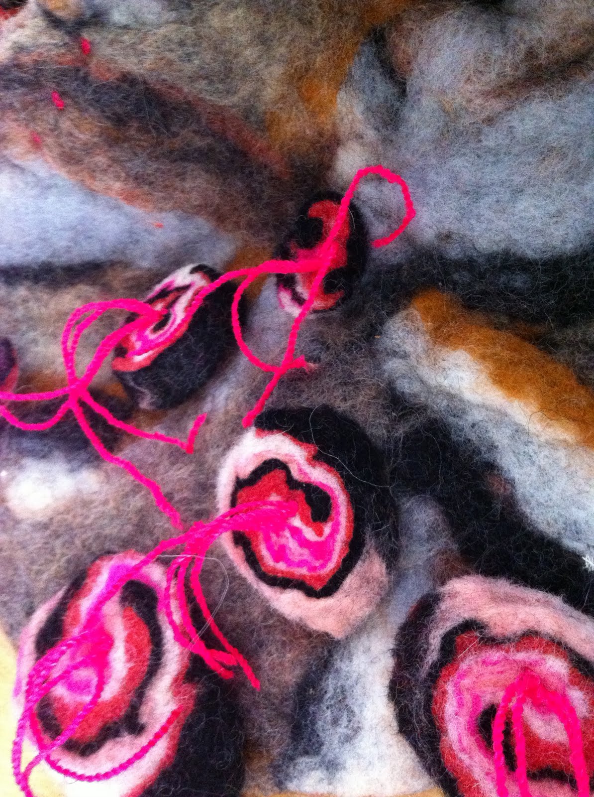
My new favorite thing is felting! I've been taking a series of felting classes at Oil and Cotton Creative Exchange in historic Oak Cliff in Dallas, TX. They have been fun, informative and great experiences. The more felting I do, the more I want to do! Lizzy Wetzel has taught the felting workshops last fall and this spring and they are really helping me get ready to teach felting in my classroom next year.

One classmate's fun dog portrait in felt

We've dyed wool, worked with prefelt, made thick felt, shaped felt into sculptural forms and more! The timing of today's play time couldn't be better because I'll be attending the Surface Design Association's Confluence conference in Minneapolis next week. One of my anticipated activities is a 5 day workshop to make a coptic style felted book. I can't wait! Anyway, Oil and Cotton offers LOTS of different kinds of classes for kids and adults. Check out their blog to find out more and sign up for classes and have some summer fun!

One of Lizzy's felted samples

Friday, February 04, 2011

Snow Days & Artist of the Week

My own See.Saw picture - Christine Miller - date, the great blizzard of 2011

Unprecedented! We have missed 4 days of school this week because of this massive winter storm that has stretched across the country! Talk about a long winter's nap!! I haven't been napping. It has been a wonderful time for me to work on several projects: weaving samples for my guild's overshot study group, taking the scans from my Sketchbook Project's book and making a digital version, goofing around on the computer, and playing with this art idea I stumbled upon (if you haven't been on this site, you have to go! Be prepared to burn some major time stumbling!!).

It's not a new idea, but I like what the artist has done, and he inspired me to try it for myself. I think this would be a great project to take into my art classes! Lots of grade school teachers do it to make butterflies and such - you put paint on one side of your paper, fold it closed, open it and you end up with these identical paint splotches on both sides. (I was so excited, I forgot to take a picture of my splotches before I drew my picture!) I used cadmium red pale hue, cadmium yellow, and cerulean blue watercolors. I also splashed some beautiful gold watercolor out of a Japanese pot. It didn't take me long to see the monkey, bird and camel in my drawing. The golden ribbony smoke came next, then I thought to add the Aladdin's lamp and the carpet at the end. It was fun! Check out the link in the post headline to see the original site I stumbled upon. It's the work of L Filipe dos Santos from Madrid, Spain - he calls it his See.Saw series. You can see more of his work here.

Tuesday, January 25, 2011

10/11 Academic Decathlon The Great Depression Art Selection #18 - Nighthawks

Nighthawks, Edward Hopper, 1942, Oil on canvas, 84.1 x 152.4 cm (33 1/8 x 60 in.), The Art Institute of Chicago

Edward Hopper studied at the New York Institute of Art and Design and became a commercial illustrator. He went to Europe in 1906, but just like Grant Wood and Thomas Hart Benton, he did not embrace the theories and techniques of modernism. He preferred painting in a realistic style. Though he lived in the city, he was preoccupied with isolation and loneliness. His paintings reflect this duality - single figures in communal spaces, cities deserted except for one person. He did not initially enjoy success from his personal artwork and had to continue to work as a freelance commercial artist. By the time he was 40, he had only sold one painting.

He married Josephine Nivison who helped him promote his art. She was an extrovert, he an introvert, and she had a good instinct for business. She helped him get six of his paintings into an exhibition at the Brooklyn Museum in 1923 and that proved to be the turning point for him. He gained attention, sales and commissions and was able to quit his job and begin to paint full time. The critics loved his work. He sold paintings to major museums and became financially comfortable. His peak productivity time was during the 1930s, but he painted until he died in his studio in 1967. His wife bequeathed his artwork to the Whitney Museum in New York.

Nighthawks shows a corner diner brightly lit against the night. The glass walls provide an easy view into the diner and the contrast between the spotlighted inhabitants and the darkened street make it seem like actors on a theater stage. We see them, but they do not notice the viewer. The scene is unremarkable, people dining, talking, a couple together, one man sitting at the counter alone. The server is waiting on them, but at this moment in time is also a bit disconnected and off to one side. Detail is spare both in the diner and on the street. You don't see anything in the shop windows, no litter on the streets, no sign of humanity except the people we see. It's almost as if the city is empty except for these four people and the scene has a quality of eerie solitude about it. (Anybody ever see the "Twilight Zone"?) We see a story, but don't know what to make of it. Barbara Haskell, an art historian, calls this "suspended narrative" or a "narrative of inaction". It's compelling for the viewer - you can make up your own story. Hopper gives the viewer a lot of creative license in the interpretation of the scene. What do you think is going on?

Self-portrait, Edward Hopper, 1925-30

Sunday, January 23, 2011

10/11 Academic Decathlon The Great Depression Art Selection #17 - And the Migrants Kept Coming

And the Migrants Kept Coming, Jacob Lawrence, 1940-41. Tempera on gesso on composition board, 12 x 18" (30.5 x 45.7 cm), The Museum of Modern Art, New York, NY

Jacob Lawrence did not have a stable life - his parents divorced and he moved from one foster care home to another until he was about 13, then he and his brothers and sisters went back to live with their mother. He took art classes early and went on to study at the Harlem Art Workshop, the Metropolitan Museum of Art, and the American Artists' School. Outside of the art classes he took, the also got a lot of energy and inspiration from the artists that had flourished during the Harlem Renaissance. (See the post done about Aaron Douglas on this blog in October 2010)

He was a mover and a shaker. He had a studio while he was a student and got a solo exhibition of this work at the Harlem YMCA in 1938. At that time, he made small paintings reflecting daily life in Harlem. He was a product of his neighborhood and drew a lot of inspiration and identity from Harlem. He also was interested in history and did a series about Frederick Douglass, a former slave and orator. These were well-received, so he did another series about the Underground Railroad leader Harriet Tubman, Haitian liberator Troussaint L'Ouverture, and abolitionist John Brown. These series prepared him for a huge project he would undertake: a 60-painting series on the Great Migration. This is the work that would jettison him into the larger art world - he became the first African American artist to have one of his works included in the permanent collection of the Metropolitan Museum of Art.

This work, And the Migrants Kept Coming, was the last painting in the Great Migration Series. A crowded railroad platform is shown and the wavy lines beneath this platform suggest water beneath a dock. The composition is crowded with people, young and old with their luggage. The way the image is laid out, you can imaging people stretching beyond the canvas edges in both directions. The people lack faces or individualized features - this helps the viewer think of them as "anyman" and connects to the larger idea of vast numbers of people looking for a better life; people who are willing to leave their own lives behind in the hopes of finding a better one. He uses only a few colors, but even though his figures are reduced to shapes, the viewer recognizes the image as many men, women and children on the move. There is not texture or nuance in this painting, and the paint he uses is a matte finish - a finish that is dull and unreflective. All of the paintings in this series use the same elements of simplified shapes out of seven colors which unifies the group and makes the series visually cohesive.

Many African American people were poor sharecroppers in the South - they owned nothing and eked out a subsistence living. The industrial boom centered in the northern part of the United States in the early part of the 20th century and promised jobs and a better life. Huge numbers of African Americans migrated to the north and poured into cities such as Chicago, Cleveland, Detroit and New York. Because discrimination was still a stronghold across the nation at that time, these immigrants would form their own neighborhoods such as Harlem in New York. Their move to these new cities was a mixed bag - they may have found work and a new life, but they did not escape the prejudice and discrimination that they had experienced in the South. Racial tensions resulted from this new influx of people.

Lawrence's documentation of this phenomenon is based in history. He researched the Great Migration and strove to document and educate the viewer about the event. Each panel has a short title that is descriptive of the scene. The early paintings depict scenes of life from the South and show the reasons the people decided to leave. There are images of withered cotton plants and is entitled, "They left because the boll weevil had ravaged the cotton crop." The middle paintings go back and forth between the South and the North. Then the later paintings show the trials and the triumphs of the migrants in their new lives. These paintings resemble a storyboard for a cinematic undertaking. The critics responded so well to this monumental work the Phillips Collection in Washington, D.C. and the Museum of Modern Art fought over who would own the complete series. In the end they split the paintings with the Phillips getting the odd-numbered panels and MoMA receiving the even numbered panels. Cool! How about that? He may have also been the first African American artist to have two major museums fight over his work!

Jacob Lawrence self-portrait, 1977, gouache on paper

Saturday, January 15, 2011

10/11 Academic Decathlon The Great Depression Art Selection #16 - Departure of the Joads, from the Grapes of Wrath

Departure of the Joads, from The Grapes of Wrath, Thomas Hart Benton, 1939, Lithograph on ivory wove paper, 327 x 470 mm (image), The Art Institute of Chicago

Thomas Hart Benton was a rebel. The men in his family were professional politicians and military men - his great-great grandfather was governor of North Carolina, his great-great-uncle colonel in the Confederate army, his father was a colonel, and Congressman. But Thomas did not follow in the steps of his family, he left military school in Missouri in 1907 to go study at the Art Institute of Chicago. Eventually he studied in Paris during a period when Modernism was flourishing. When he returned to New York, he became an art teacher to Jackson Pollock and Rita Piacenza. Pollock is the famous abstract expressionist (who went on to be called "Jack the Dripper") and Rita became Benton's wife. He was in the midst of a variety of styles of art were exploding, but none of them really resonated with him.

When Benton's father fell ill, he returned home to Missouri to sit as he was dying. It became a pivotal moment in his life and he wrote about it in his memoir:

I cannot honestly say what happened to me while I watched my father die and listened to the voices of his friends, but I know that when, after his death, I went back East, I was moved by a great desire to know more of the America which I had glimpsed in the suggestive words of his old cronies...I was moved by a desire to pick up again the threads of my childhood.


So he began painting rural scenes and people from the Midwest and made these images symbols of the struggles and triumphs that happened in these humble places. Benton was at the forefront of a new "ism", this one American - Regionalism - one that is synonamous with the 1930s. He painted a series of murals for the 1932 World Exposition in Chicago depicting the history and culture of Indiana. He did not censor the bad with the good and included images of the Ku Klux Klan burning a cross, unemployment lines and labor riots. Though critics railed at these images being so public, Time Magazine put him on the cover and declared him to be one of the definining artists of the time.


Trying to take this subject matter and interest the art scene in New York was another matter. New York was on the cusp of becoming the art center of the world and tastes favored the modernism coming out of Europe, not the rural, earthy images of people and places in America's heartland - it just wasn't sophisticated enough for that scene. He turned his back on New York took a teaching position at the Kansas City Art Institute and taught and worked until his death in 1975. He is one of the most important artists of his day and his work is still respected as central to the Regionalism movement.

The series he did about The Grapes of Wrath by John Steinbeck, include a lithograph entitled Departure of the Joads. There are many ways to make prints (see this excellent explanation called "What is a Print" by MOMA); a lithograph print has the image drawn on stone or metal instead of being etched into metal.

This lithograph illustrates a scene from the Grapes of Wrath, the moment that the Joad family is preparing to leave the poverty they faced in Dust Bowl of Oklahoma in order to find a better life in the rich fields of California. The image is printed in black and is rich in tones of grey between areas of black and white. The crescent moon is about in the center of the print and lights up part of the sky while the other half remains dark.

One detail of Benton's style is the curving lines you see everywhere: the ground, the clouds and even the figures undulate which creates a sense of movement. The house, clouds and logs all lead your eye to the family - even the light, moonlight sky highlights them in their departure activities. Not all of the family members are glad about this move - the women and Grampa (who sits forlornly by the door of the shack) look dejected and powerless about the decision. Ma Joad embraces Granma to support her in her decision to leave with the family, leaving Grampa behind - he refuses to leave. The scene is packed with a lot of emotion, but the artist puts almost no facial features in the characters, and relies on the body language and poses to tell the viewer what is happening.

Grapes of Wrath, Steinbeck's novel was published in 1939 and one of the movie studios, 20th Century Fox, jumped on the book to use for a movie version. Benton was commissioned by the studio to produce the images to promote the film. Five of the artworks were portraits of the characters, but The Departure of the Joads was the sixth work he made and turned out to be the most powerful and long lived. It was enlarged to billboard size and he also reproduced it in color as a painting. It was also included in its original form in the 1940 edition of the novel.

American people across the nation identified with this powerful image - it reflected the hard times they had been through with the Great Depression and the feelings so many people felt - anxiousness, sorrow over broken dreams but a tentative optimism that is so characteristic of American people. The road represents the future and a journey to a better life. His image represents both spectrums - Grampa's inability to forge ahead and embrace change alongside Granma's hesitancy and anguish about the choice she is making. But the men of the Joad family have the courage to carry the family ahead. All of these emotions permeated the country in the 1930s and this image captured the essence of an important historical period.

On a personal note, I was speaking to my own students Friday about the hardships that this country is experiencing now. We talked about other periods of hardship our young country has gone through. This image is a powerful one today showing the characteristics of the people in this country that have made it great: vision, determination, hard work, sacrifice and grit. One of my students how long this current period of hardship would last, 5 yrs? I don't know the answer, but I have faith that if we pull together, love and support each other, we can come out of this stronger than ever.

Thomas Hart Benton self portrait, 1972

Tuesday, January 04, 2011

10/11 Academic Decathlon The Great Depression Art Selection #15 - Cow's Skull with Calico Roses

Cow's Skull with Calico Roses, Georgia O'Keefe, 1931, Oil on canvas, 91.4 x 61 cm (36 x 24 in.), The Art Institute of Chicago

Georgia O'Keefe is one of the most recognized artists of the twentieth century. It's rare to find such an accomplished woman in the art world - it has historically been a career for men. Even today, women are not on an equal footing with men in the business of art - check out the Guerilla Girls for more information about that and to see about their activisim! O'Keefe was a strong woman who followed her passion and became an icon in the art world, especially for aspiring women artists.

O'Keefe studied at the Art Institute of Chicago and at the Art Students League in New York and was exposed to a new art trend: imitative realism - a movement that was meant to artistically reproduce nature as the artist saw it. When O'Keefe took a summer class for art teachers, she was introduced to Arthur Wesley Dow who had a passion for non-western art, especially Japanese art. He believed that color, line, light and dark tones should be balanced. O'Keefe connected with these ideas and began to experiment with them. Her initial work was brought to the attention of photographer and art dealer Alfred Stieglitz. Without her knowledge, he put her work in an exhibition at his gallery in New York, 291. Her work was a hit and Stieglitz became a huge supporter of hers and began regularly exhibited her work. He was able to get her to move to New York and paint full time. They married, lived and worked together until 1946 when Stieglitz died.

O'Keefe began with paintings of New York, flowers and plants. Her flower paintings were so close up, you lost the overall image of the flower and just focused on the details. It's said that O'Keefe responded about these paintings once by saying she wanted the viewer to stop and really look at the flower. Her love for nature took her out west to New Mexico and one visit was all it took to hook her for life. Take a look at this 10 minute video and listen to her tell her story about her love of New Mexico. She began painting desert scenes, including bones and skeletons of dead animals. The pure line, light and shade she used in her other paintings transferred perfectly to these new subjects. She kept going back to the Southwest all through the 1930s until Stieglitz died then she settled in Arizona and lived out her life into her 90s. Her work became so important, she was given a solo retrospective at the Museum of Modern Art in New York City, the first woman to receive such an honor.

This work, Cow's Skull with Calico Roses, uses many shades of white to create the skull and roses over an unidentified white background. The value creates an image that looks three dimensional (remember, it's painted on a two dimensional canvas). It is symmetrically balanced with the focal point centered in the picture plane. The painting is a still life, but the composition is strong and bold. O'Keefe loved painting nature, and this skull was beautiful to her, not morbid. The juxtaposition of the soft flowers with the brittle bone make for an interesting combination. They could be speaking of both life and death, but ultimately speak of the beauty of nature. Her approach to her paintings is pure and direct - she had an eye for capturing nature and detail without making it fussy and busy. Her paintings are elegant, spare and compelling. Her work is beautiful and haunting and helped establish a modern aesthetic in the world of art.

This post seems woefully incomplete. Stieglitz and O'Keefe had a powerful love story and an incredible artistic connection. He was one of the twentieth centuries most reknowned photographers and Georgia was often his photographic muse. I have always enjoyed reading biographies of artists throughout my life, and reading their biographies were some of my favorites. Explore their lives for yourself - you won't regret the time invested.

Sunday, January 02, 2011

The Sketchbook Project


I signed up to create a sketchbook for this traveling exhibit of sketchbooks. Over 28,000 people from 94 countries have signed up to do this! The deadline to postmark our sketchbooks is January 15, 2011. I have been working like mad over the holiday to finish my book. I'm not quite done, but I see the end in sight. When I signed up for the project in October, I chose the theme "Mystery Maps". It sounded juicy to me.

The day I received my sketchbook, I had a realization: after my father's death, I asked for one thing that belonged to him - his satchel of maps. He began traveling around the US after he retired from teaching and collected maps from all the places he visited. That bag of maps sat in my closet for seven years. I knew immediately that I would use the book to explore my dad's travels. This is the cover of my book. You can see my artist profile for the project here. I'll post more info about this project later, right now I have to get back to work on it!!