Follow Me on Pinterest

Sunday, December 14, 2008

08/09 Academic Decathlon Image #18

From Spaniard and Black, Mulatto (De Espanol, Y Negra. Mulato) Attributed to Jose de Alcibar, 1760-1770, Oil on canvas, 31 x 38 1/4 in. (Art during the Colonial Era)

Ethnic mixing is not new - this work shows a common situation in colonial Mexico in which different races came together in marriage and produced a child that at that time was labeled "mulatto". The painting is a genre scene (showing an everyday happening). The woman is wearing a rebozo (see previous AcDec post about rebozos), which indicates she is of middle- or lower-class. She is cooking and gazing affectionately at husband and son. The father also gazes down on his small son with a loving expression.

The young boy is the focal point of the composition. He is lifting a brazier so his father can light his cigar. This skillful oil painting is careful in the portrayal of each subject's body positions and facial expressions. This piece (numbered 6) (you can see the label in the upper left hand corner) is one in a series that would have comprised a set. For someone to have owned a set of paintings this size, they would have been from the more wealthy social class.

The elite felt threatened by people who mixed racially, but race relationships were complicated and confusing because you couldn't always identify a person's race just from their appearance. People of European descent (and especially those from Spain) wanted to identify strongly with their white, European heritage to maintain positions of power.

Check out this PowerPoint about art in the Colonial era.

08/09 Academic Decathlon Image #17


Beaker, Maya Civilization, 600 A.D., Polychrome ceramic, 7 x 5 in. (Pre-Hispanic Art)

Have you ever made a pot using the coiling technique? You role out a long snake of clay and coil it into the shape you want. Then you use water and your fingers or a tool to smooth the surfaces. It's a fun way to make a pot! The Mayan potters used this technique because they didn't have a potter's wheel. After forming the shape, they would let it dry until it was leather hard, then paint it with "slip" (minerals and earth materials mixed with water to make a kind of paint.) They know this was made in the Classic period because it has so many colors.

Two males are seated, dressed in elaborate textiles and jewelry. They have make-up and headdresses. The smoke that seems to come from the figure in the front is meant to indicate speech or communication. The heiroglyphs above their heads could detail their identity or the nature of the ritual. Hooked noses were aesthetically pleasing to them. The figures are stylized but look naturalistic.

Here's a quiz you can take about the Mayan and a beaker. See how you do! There is also what appears to be a high school PowerPoint on the web that is related to the work chosen for AcDec - check it out! Scroll down the presentation to see the beaker slide, but check out the others! It has some great information in it!

08/09 Academic Decathlon Image #16

Figure in Illuminated Doorway, Rufino Tamayo, 1960, Color lithograph, 65 x 50 cm (Art after Independence)

Tamayo, though he had contact with artists such as Siqueiros and Orozco, and was aware of the work of Rivera, took a different path, made work that was rather small and not political in nature. He lived and taught in New York and in Paris. In 1960 (the date of this lithograph), he moved back to Mesico until his death in 1991. He and his wife had an impressive collection of Pre-Hispanic art and left it for a museum in Oaxaca. Another museum (Ruffino Tamayo Museum of Contemporary Art) opened in 1981 and houses his work along with other contemporary artists. (There is also a PowerPoint from another high school that references the work after Independence. It has highlights about the pieces.)

This type of print is unlike the etchings in the previous posts. This is a lithograph - check out MOMA's explanation of printmaking - you will learn about 4 processes here! THIS IS A FABULOUS FLASH DEMONSTRATION OF THE PRINTMAKING PROCESS - YOU MUST CHECK THIS OUT!! (You can tell I really like this site!)

Anway - he was interested in still life and genre scenes (images of everyday activities). This female silouette in in a doorway with one hand resting on the doorframe. It seems that her head is covered by a veil and is shaped kind of like a keyhole. His palette is simple - black, white, red and shades of yellowish-browns. The featureless figure could represent common experiences at key stages in life. Modern subjects often move towards themes that have broad universality with the viewer.

08/09 Academic Decathlon Image #15

Don Juan Joachin Gutierrez Altamirano Y Velasco, Miguel Cabrere, 1752, Oil on Canvas, 81 5/16 x 53 1/2 in. (Art during the Colonial Era)

This piece resides in the Brooklyn Museum. Notice the similarity in this Imperial portrait to that of Louis XIV of France by Hyacinthe Rigaud painted around 1701! Copy Cat! (In art we call it appropriation!)


What was more important in an imperial portrait was to convey the subject's status rather than an accurate likeness. (His powdered wig is a big status symbol.) He is portrayed as aristocratic with thin, refined features, long slender fingers and light skin - all traits valued by the elite in New Spain.

Oil paint on canvas was used to create this life-size portrait. Oil paints are perfect for creating tiny details. You can be sure this large portrait cost a pretty penny. Cabrera had a workshop with assistants: they helped him prepare the materials as well as paint the least important sections of the painting.

"Don Juan Joachin held the titles of the Sixth Count of Santiago de Calimaya and the Seventh Marquis of Salinas de Rio Pisuerga as well as maintaining a position of power within the Church. He was a wealthy landholder in both Europe and New Spain. His ancestors were explorers and conquistadores, and from them he ingerited the honarry title of High Governor-in-Perpetuity of the Phillipines (a purely ceremonial role)." Whew! No wonder he needed a huge picture of himself!!

08/09 Academic Decathlon Image #14

Tikal: Temple of the Giant Jaguar, Maya Civilization, 731 A.D., Cut stone masonry, 144.4 ft. (Pre-Hispanic Art)

This site is located in Guatemala and was thriving in the Classic Maya time period. Unlike the previous city at Teotihuacan (which was laid out on a grid), Tikal is arranged in a more organic manner, clustered around separate courtyards. They seem to have been created on an as needed basis, without a clear master plan.

This city had pyramids, monumental palaces and thatched houses that were on earth and stone mounds. Tikal had six temple-pyramids, and though the Temple of the Giant is not the highest, it is one of the most important. The jaguar was revered as a powerful animal that demonstrated divinity and leadership. One of the Mayan leaders, Jasaw Chan K'awiil was buried in this temple and identified with the Jaguar's power. In his tomb were typical afterworld objects - containers for food and liquid as well as personal ojects made of jade and precious materials.

Here are some quotes from your AcDec Art Resource Guide, but also check out the link in the image title for a website about Tikal National Park. "...the Temple of the Giant Jaguar is constructed of rubble and limestone blocks. It is a stepped pyramid built on nine levels. The pyramid is tall and quite steep...The pyramid was probably covered with plaster, and there are indications that some elements were painted.....The pyramid was a burial site, and it contained narrow pasageways and rooms, dome decorated with fresco paintings. The small size of the passageways and rooms within the temple indicates that it was not designed to hold large numbers of people at a time......it was built during the Late Classic Period."

08/09 Academic Decathlon Image #13

View of the Street of the Dead, Showing the Plaza of the Moon and the Pyramid of the Sun, Teotihuacan, 1-750 A.D. (Pre-Hispanic Art)

This city flourished at a time that was known as the Classic Period from 150-900 A.D. A lot of growth and development happened at this time leading the city to have great influence in the region. Because of the material culture left behind in their ruins, experts can surmise that there was a lot of trade and political domination. Teotihuacan (as well as Remojadas mentioned in a previous post) are in close proximity to the Gulf of Mexico.

The culture was sophisticated (and the 6th most populous city in the world in 600 A.D.). The city had religious and political rulers (along with the requisite warriors!) and was surrounded by peasant farmers. The Maya and Zapotec peoples had writing systems that were well developed. There were may gods that were worshipped who seem to have spun out of the Olmec deities. Some of these even became important to the Aztecs. As a result of the cultural development the people built monumental civic and ritual architecture to show their Power & Authority (a common theme in the Art History class!). We see the pyramid shape as a dominant shape for their temples and tombs (familiar???). Check out the hyperlink in the image title to go to an guide to the archeological site in Teotihuacan.

Saturday, December 13, 2008

08/09 Academic Decathlon Image #12

The Flower Carrier, Diego Rivera, 1935, Painting, oil and tempera on Masonite, 48 in. x 47 3/4 in., (Art after Independence)

The history of Diego Rivera (and his wife Frieda Kahlo) is a wonderful, tragic love story of two artists that had a stormy and turbulent marriage. He was an established artist when they first met (she actually took her paintings to show him as a young woman, interested in getting his approval).

He is best known as a mural painter (using the technique of fresco), but he also produces smaller artwork such as this one. His paintings were of landscapes, still lifes, portraits and genre scenes (scenes of everyday life). Perhaps because he was used to creating such large works, the figures in this piece are monumental considering the picture plane - the fill the entire surface. He uses earth tones contrasted with the bright magenta of the flowers and the white costume of the peasant. Your AcDec Art Guide suggests that "the harmonious relationship between the two figures perhaps indicates an overall balance and stability in the rural life of Mexico."

08/09 Academic Decathlon Image #11

Untitled (Our Lady of Guadalupe), a page accompanying a thesis submitted to the law faculty in Guadalajara by Joseph Turibius Gonzalez et Ramirez, Francisco Aguera Bustamante, Engraver, 1796, engraving, 11.1 x 7.3 cm (image) (Art during the Colonial Era)

This particular kind of image of the Virgin Mary is specific to Mexico and is still an very important symbol of national identity. She is reported to have appeared in Mexico in 1531 just after the Spaniards defeated the Aztecs. During this time, large numbers of Aztecs were converting to Christianity.

The narrative specific to this vision of the Virgin involves a poor Aztec man , Juan Diego Cuauhtlatoatzin (1471-1548). He had already converted to the Catholic religion. One day on his travels, he experienced a vision of the Virgin on a hill. She sent him to the bishop with the request for a church dedicated to her in that spot. Not surprisingly, when he delivered his story of the vision and instructions, he was spurned by Bishop Juan de Zumarraga.

Juan Diego went back to the spot, waiting to see the Virgin again. When she made another miraculous appearance, she dispatched him to find a rare species of rose that would not have normally been growing at that time of the year. He set off on his mission and wrapped the flowers in his tilma (a type of cape). The virgin arranged the garment with the flowers and sent him back to the Bishop.

When he opened his cape to reveal the flowers, a miraculous image of the Virgin appeared on his garment, and the Bishop fell to his knees and agreed to build the church at the top of the hill where there had been an Aztec temple. The power of the miracle has transferred to this symbol as the patron of the masses.

08/09 Academic Decathlon Image #10

Standing Female, Jalisco, 200 B.C., Ceramic, 7 1/4 x 3 1/2 in. (Pre-Hispanic Art)

The top figure was excavated in the state of Jalisco, the bottom one in Michoacan. Both are made of clay.

The top figure is tall and thin and stylized with elastic-like arms. One of her arms rests on her waist while the other reaches in front of the body and touches the necklace she's wearing. The necklace and headdress are formed from coils of clay.

The bottom figure is short and squat and has more clay details on the figure. The four circles on her upper arms could be body adornment or scarification. She, too, has a necklace which may represent carved shells or stones.

Little is know about the purpose of these figures, though their location in mass graves indicates they were probably burial offerings. Check out more about the history of Pre-Columbian art.

Standing Female, Ancient Michoacan, 200 B.C., Earthenware, 6 x 3 in. (Pre-Hispanic Art)

08/09 Academic Decathlon Image #9

Valley of Oaxaca, Jose Maria Velasco, 1888, Oil on Canvas, 41 7/8 x 63 1/4 in. (Art after Independence)

Jose Maria Velasco lived and worked in the mid-19th century in Mexico. He was trained as a painter and the style of the landscapes he painted was picturesque and idealized. He was dedicated to painting landscapes that were not only Mexican, but were also clearly identifiable to his viewers.

This painting is a large scale work from the peak of his career. He has a bird's-eye view of the valley. Natural flora and fauna are portrayed in the detailed foreground. The group of people are in indigenous dress and are of the peasant class. Notice the small wooden cross on the small hill behind the figures. Not only was Velasco a devout catholic, but religious imagery like this was common in the rural landscape.

Also we see the grid of the growing city portrayed with the use of linear perspective. He also used Leonardo's famous artistic device, atmospheric perspective (the colors in the background are more blue and the sharpness of detail is softened further away), to additionally create a vast depth of space on the two dimensional picture plane. Working with oil allowed not only for the precision of his work but also for the delicate shading of color to create this panoramic view.

08/09 Academic Decathlon Image #8

Codex Huejotzingo (Painting 5), Nahua Culture, 1531, Hand-painted document on maguey (a pre-European paper)(Art during the Colonial Era)

Sometimes art techniques are used for record keeping and as a documentary tool like this Codex page. Remember that a codex is an early form of a book. This particular page is a record of the tribute provided to the court by the town of Huejotzingo. Different objects and people are arranged carefully on the page in a straightforward manner. The focal point of the composition is of the Virgin Mary and Christ Child.

This visual list of tribute shows that payment included pots of amber, gold plaques, a banner and a standard with the image of the Virgin Mary and Child, loincloths, and metal-tipped darts. The people with rings around their necks and sticks protruding are slaves. Someone who was skilled at reading the visual symbols could quickly analyze the offering.

The maguey is made by stripping the inner leaves of the agave cactus. After it is dried it has a light silvery color. The colors are made from earth pigments with details from gold leaf (which was very expensive). Whoever created this page was highly skilled in handling these materials. Check out this link from Sharon Cohen, a world history teacher in Maryland and her approach to teaching this piece in her classroom.

08/09 Academic Decathlon Image #7

Smiling Head, Veracruz, Ceramic, 6 x 7 in. (Pre-Hispanic Art)

This piece of hollow ceramic work is considered unique in the Classic and Epiclassic period. Because this piece was found along with tens of thousands clay figurines at the site called Remojadas, the identifying classification "remojadas figures" is applied to such objects.

The shape of the head is stylized and reflects their idea of beauty at the time. Made of clay, it was shaped while in a plastic state and then fired. Some of the figures had the addition of paint on the surface emphasizing certain features. As with so many artifacts, the exact purpose of this object is unknown, but many of them were found in burials. But, smiling figures are very rare in ancient Mesoamerican art, so this smiling head must have had special significance. Be careful not to put your own cultural understanding of a smiling face as an expression of happiness in your interpretation, because this ancient culture may have had a very different significance for the expression!

Tuesday, December 09, 2008

08/09 Academic Decathlon Image #6

La Calavera Catrina (Calavera of the Fashionable Lady), Jose Guadalupe Posada, 1913, Relief Etching on Zinc (Art after Independence)

The first thing I want to mention is that Posada produced at least 2,000 plates for etching in his lifetime! Ay caramba!!! That is prolific! His work is often satirical, and his calaveras (skull in Spanish) were shown in every kind of activity as social and political satire. Like so many other artists, though he spent his life expressing the world he saw around him, he died in relative obscurity. Diego Rivera told stories about Posada as his teacher, though the veracity of those stories is questionable.

This print is one of his most famous. The etching process involved engraving on a sheet of metal then treating that metal in an acid bath that left the lines in relief. Many copies were printed from that plate which made it economical and capable of being distributed widely. One of the factors in his lack of notoriety is that he was paid much like a skilled laborer instead of a fine artist.

This skeleton is dressed in the fashion of a wealthy woman with her elegant hat and fancy hair ribbons. But as is often portrayed in Art History, death is a stranger to no one, and for the working class there was an element of comfort knowing that the powerful would meet their maker as everyone else. The grin and festive attitude of the calavera reminds the living to not take life so seriously - it's only life, after all! Read more about Posoda, etching, Diego's connection and more here.

08/09 Academic Decathlon Image #5

Shawl (Rebozo) Late 18th c., Silk Plain Weave with Resist Dyeing and Silk and Gilt Thread Embroidery in Darning, Satin, and Outline Stitches; Knotted Fringe, 30 1/2 x 93 3/4 in. (Art during the Colonial Era)

This luxury garment, the Rebozo, is typical of colonial New Spain and post-colonial Mexico. This particular example is made entirely of silk: embroidery on a woven fabric which is done so expertly it is reversible (a very accomplished feat!). Many women of this time period spent lots of time mastering the art of embroidery. Time was not rushed and the many hours spent in producing a textile like this resulted in a garment that was highly valued. Silk was a luxury fiber then and this rebozo would have been owned by a wealthy woman, though the style was also produced in practical cotton affordable to women of the working and merchant class. These are not just decorative garments, but are also very utilitarian as this website demonstrates.

Monday, December 08, 2008

08/09 Academic Decathlon Image #4

Olmec Figure Sitting, with Spread Legs, Olmec Civilization, 2000-900 B.C., Low-fire earthenware, 9 1/2 x 8 3/8 x 5 in. (Pre-Hispanic Art)

This small sculpture has a mystery about its function, perhaps it had a special ritual use. The Olmecs made megalithic heads that are compelling and powerful. But this seated figure is also typical of their sculpture. The figure is soft and natural - almost boneless - and is genderless. The body is compact and sturdy looking and the face expressive and detailed. Made of earthenware, it was created using an additive sculpture technique then fired to make it hard. Because clay can crack if it dries out too quickly, the artist made small perforations in the eyes, nostrils and navel that provided air vents during the firing process. This hollow figure is somewhat rare in relation to the figures sculpted from stone.

Check out the "Seated Ruler in Ritual Pose" that the Dallas Museum of Art has in their collection. Compare the two: do the postures and materials communicate different ideas? How do simple marks create expression? Consider this statement from the Museum's info about this piece: "As one of several objects deposited in a burial cache, a greenstone figure such as this may have signified the renewal of life, especially when it was coated with cinnabar, a mineral whose red color represented the life force of blood." Do you agree with this thinking? We may never know all of the answers - even the scholars can only theorize about some of these ideas. All the more reason to do your own surmizing!! Click on the Post title to visit a site about the Olmec culture - it's packed with information!

08/09 Academic Decathlon Image #3

Frieda and Diego Rivera, 1931, Oil on Canvas, 39 3/8 in. x 31 in. (Art after Independence)

This portrait of the couple, which looks like a traditional wedding portrait, does not reflect the stormy passions that affected their relationship. Frieda married Diego Rivera when he was an established artist. She was a fledgling artist at the time, but in this portrait looks submissive and demure - she was anything but! She did not take her husband's name, but kept her own - a very unorthodox thing to do in the early 20th century. So this portrait is appropriate in the conservative culture of Mexico: she was expected to be wife and mother. But - the inscription above her head tells it all. She states that she is the artist and that the work was not for personal pleasure but for an art collector, Albert Bender.

To read more about the life and times of Frieda Kahlo, click on this link.

08/09 Academic Decathlon Image #2

Mosaic Skull and Jaw, Aztec Civilization 1350-1521, Bone, stone mosaic, and teeth (Pre-Hispanic Art)

This art piece is a human skull that is covered with small pieces of cut stone and shell, a mosaic technique. The pieces, called tesserae, are arranged in a deliberate manner over the surface of the skull. Notice how they are arranged in concentric circles around the eyes - even pieces of white shell or stone are used for the eyes and have been drilled to indicate the pupils. The turquoise used is valuable and communicates power. This skull was possibly used for ritual purposes.

Skulls like this are associated with human sacrifice. We know that the Aztecs thought that human sacrifice was necessary in order to satisfy the gods and keep their world in harmony. The Spanish, when they were invading the Aztecs, thought them to be barbarian - all the more reason to quickly eliminate them and exert their own authority. No doubt they collected these artifacts and took them back from their expeditions as there are a number of such skulls that are in museum collections throughout the world. Check out this site that has other jade and turquoise masks. Scroll down to see some that are similar to this example.

Sunday, December 07, 2008

Art Daily - an Art Newspaper on the Internet

Okay, where have I been?!?!? This is the first art newsletter to be on the Internet since 1996 and I'm just finding out about it. Never mind.......thank goodness Mr. Miller sent me a link after he started Googling Eliasson. AND, that was a result of my taking him to the DMA to see the Eliasson exhibit, which he said was "tremendous". (see post made on 11/21/08)

As a studio art teacher, Art I teacher and Art History teacher, this website has something for EVERYBODY!! From the classic artists and paintings to the current, up to date exhibits and news, this site seems to have it all. There are even games and puzzles you can play to test (ahem!) your art knowledge! Explore, have fun, check it out, make it a daily delivery to YOUR inbox like I have!!

Saturday, December 06, 2008

Andy Goldsworthy

"Photography is a way of putting distance between myself and the work which sometimes helps me to see more clearly what it is that I have made. " - Andy Goldsworthy

Our school library got Andy Goldsworthy's DVD "Rivers and Tides" and I showed it in class to the Freshmen on Friday. I was very moved by his work and the dedication he has to his art. The integration of his vision into the environment he installs it into is incredibly beautiful.

What did you think about his work? What about the process he goes through to create environmental art? Did you get a sense of the level of commitment he has to perfection? I loved the way his palette moves from intense, high contrast color combinations to subtle, sunbleached neutrals. Did you like the video? What were you impressed about? The link I have in the Title takes you to a Flickr portfolio of some of his work. Be sure to watch it in slideshow mode - link in the upper right hand corner of the page.

Student Work - AP 2D Studio Art

This is created by one of my students, Desiree, for an optical illusion assignment. Great piece of digital art!! I found this short video clip featuring other eye popping illusions. Check it out - click on this post's title - it's a doozy!

Friday, November 21, 2008

Art History DMA Late Night Olaf Eliasson Art Adventure

Okay - so for those who don't know, some of my Art History students and their friends met me at the Dallas Museum of Art Late Night (let me give a major shout out about that fabulous experience) to have a "learning lab" about art. We go to check out different parts of the museum (the permanent collection and special exhibits) at the once a month event in order to expand our study of art, but most importantly to see the art up close and personal.

Sooooooo......I asked my students to come to the blog and comment on their Friday night art experience. Guys - PLEASE DON"T make a comment until you go to his website and check out more of his work (it's linked in the post headline)! It is an INCREDIBLE body of work!!! (Oh, and a word about Eliasson's website - it is SUPER simple - a grey screen with links in white text. No visuals appear on the homepage - you have to go to images and continue clicking on the white text links until you got to the image list. The spareness of his website is a big contrast between the visual saturation of his work.) AND, check out the video that features an interview with the artist on his exhibit "Take Your Time" at the DMA.

How does seeing a larger selection of his work affect your opinion? Can you imagine being "in" those other pieces after your experience?

Here's my response to his work and the experience - I really loved it! Being bathed in colored light is a magical experience. Isn't it cosmic that we are studying Gothic stained glass windows and the Divine Light they produced? How did the light make you feel? Could the light Eliasson creates be considered "divine"? Our guide, Ms. Marvel, spoke about how his work reaches across Art History - can you make any other connections to work or cultures we have seen previously? I have a penchant for shiny things, so the glass and mirror installations caught my eye. I had no prior knowledge of Eliasson's work, so the experience was new and fresh for me as well.

We ended on the note of whether his work (or other work of the same ilk) is art or not. How is his work art (or not)? And, if you don't think it is art (which is a legitimate response by the way), why would a museum consider it to be art? How is conceptual art differenct from representational art? It was an awesome night, thanks again for taking time to come to the museum with me - I can't wait to hear what you have to say about it!?

Friday, November 14, 2008

Student Work - AP 2D Studio Art

I'm so excited about the student's work from this project, I decided to make a collage of some of their self portraits! From top left clockwise is Emily, Lauren, Erin and Mary Rachel. We took digital pictures, converted them to grayscale and they reproduced their image into a picture plane of 4 quadrants. They treated each quadrant with separate color relationships. Mary Rachel's is digital, the others were created with multi media. Great work, girls!!

Monday, November 10, 2008

The Design of the Flag

Tomorrow is Veteran's Day - a time to celebrate the important job our Military does to preserve our freedoms. Flags fly everywhere as we reflect. This site is dedicated to the United States Flag. Our flag is an artistic expression of this country - each color, shape and arrangement symbolic of this great land.

(From the website:) 50-Star Flag: Executive Order of President Eisenhower dated August 21, 1959 - provided for the arrangement of the stars in nine rows of stars staggered horizon tally and eleven rows of stars staggered vertically. This is the current flag of the United States. Hawaii was admitted as the 50th state on August 21st, 1959. The 27th flag of the United States became the official flag on July 4th, 1960. Nine presidents have served under this flag; Dwight D. Eisenhower (1953-1961), John F. Kennedy (1961-1963), Lyndon B. Johnson (1963-1969), Richard M. Nixon (1969-1974), Gerald R. Ford (1974-1977), Jimmy Carter (1977-1981), Ronald W. Reagan (1981-1989), George Bush (1989-1993), William J. Clinton (1993-2001) and George W. Bush (2001-present)*.

So check out the beginnings of our flag and notice flags of other countries. States and even cities have flags! Why not design a personal flag for yourself?

Wednesday, November 05, 2008

Obama's Logo Design

Watch this video narrated by Mark Scheffler from Chicago: A Crain's Chicago Business video profile about the firm that developed Barack Obama's logo.

Logos are incredibly powerful visual symbols used in society. We see clear designs that are simple and direct represent complex groups of people throughout society. They play a very important role in Visual Culture by communicating quickly and efficiently. Obama's logo is new and exciting. Don't be surprised to see it in lots of places - even AFTER he's been elected president! What other people, places and companies can you think of that have similar "brands" or logos? Post a comment and let us know what comes to your mind!

Sunday, November 02, 2008

Political Cartoons

Election day is close at hand. It got me thinking about the Political Cartoon and it's power. These cartoons allow the artist to communicate a complex situation in a quick and direct way. The site I have linked to this post title is a page from Dr. Paul Parker's university website. He teaches political science at Truman State University in Missouri. This webpage is a wonderful little history of the political cartoon. He outlines the 4 things an effective political cartoon need to have: 1) good artistry, 2) genuine sentiment, 3) uncomplicated imagery and 4) the subject must be of lasting nature.

I teach Art I and Speech Communication (one semester credit of each). I mix the two disciplines up all year to make it more fun and interesting for both student and teacher. Art and Speech are both about communication! It is a wonderful interdisciplinary combination. A persuasive speech is typically on the list for the year and political cartoons are perfect for the speech's visual aid. This gives my students a chance to try their hand at political cartooning.

Wednesday, October 29, 2008

Women in Art - Video


Check out this video (link in the post headline) that shows 500 years of women portrayed in art. Incredible.

Op Art


Victor Vasarely (1908-1997)Vega-Nor, 1969
Check out the display in the hall at school to see more of his work.)

6 days until the election - boy, the tension is super high - fundamental shifts in reality - seemingly polar energies in the country - 'you're either fer 'em 'r against 'em - crazy, wild energy.

I was thinking about the blog, trying to go to sleep, but I was just too wound up from a heated political conversation with a relative. There were also media loops and sound bytes circling in my head. Then it came to me: op art. That was totally it - two opposing forces in perfect harmony with each other. Typically, it's the high contrast and energy vortex of the lines that overtakes the frontal cortex. Rods and cones in a frenzy. The site linked in this post headline takes you to a FABULOUS, small website about Op Art.

Tuesday, October 28, 2008

Artist of the Week - Justine Smith

Money, money, money! That is one of the major topics in the news right now - AND, we get minute by minute updates - what's up, down, gone, promised, lost, hoarded, slashed or stashed. It got me thinking about artists that might work with money, so I googled and found Justine Smith, a British artist whose medium is primarily paper and can be more specifically money. Here's what her website has to say about this piece I'm featuring, "Money Map of the World" 2004/05.

"Her work is an exploration of our relationship with money and our response to it, in a political, moral and social sense, whilst also exploiting the physical beauty of the note. A Banknote is not only an abstract representation of our labour, but the imagery depicted on it also symbolises the ideas and ideals of a given country's culture and the society that its people live in.

The 'Money Map of the World' compounds many of Smith's ideas relating to money. This piece of work took seven months to produce and is made up of banknotes from every country in the world. The images and cultural symbols on the banknotes are significant and can give an indication not only of the economy of a given country, but also important aspects of its culture. Aside from more obvious images of the local flora and fauna, one can also see elements of a country's history, religion, its aspirations and defining achievements. In some areas such as the Middle East, spiritual and cultural alliances can be seen as groups of countries appear to merge due to the similarity of Islamic design on the banknotes. One can also see economic alliances such as the Eurozone, or West and Central African states, which share common currencies between a group of nations. Similarly, one can also see traces of old empires - some countries borders are naturally formed by rivers or mountains, but other countries borders are man-made and to an extent divided by money."

Have you ever thought about the artistic design that goes into money? The images that are promoted, the ideas, the POWER symbols. When do we stop "seeing" money - what does it represent to you? What do you think about the cutting up of money to create an art piece? We "buy" materials to make art; is it the same when we "buy" money as an art material? Look at the areas certain bills covers - does that indicate the power of the country? What makes some countries money stronger than others? Interesting stuff...

Saturday, October 25, 2008

Student Work - AP 2D Studio Art

There is a wonderful little book I bought years ago entitled "Inspirations for Embroidery Mail - Book of Days" by Jytte Harboesgaard and Debra Virgens. The two women began embroidering equilateral triangles and sent them to each other as a form of communication. After many years, they had 48 embroideries that were collected into an exhibit at The Danish Museum of Decorative Art in Copenhagen. A small sampling of their efforts is displayed as a triangle montage.

I gave my AP Studio art students an assignment based on this idea...take a geometric shape and explore pattern, design and color in your own piece. I feature K.C.'s terrific solution, sans color, but with such strong design and precision of line the color is not needed. Her exploration is innovative and exciting! Bravo K.C.!!

Tuesday, October 21, 2008

Art Block

What happens when you have an idea in your head but are having trouble getting it down on paper?

Thanks for asking this question, Alex J! Blocks can be annoying and frustrating! My advice is really pretty simple....draw, draw, draw. Transferring an idea you have in your mind's eye to paper can sometimes be difficult. I suggest you just sketch small parts of your idea and keep after it. Try to grab on to some part of your vision. Are there some special colors (do a quick color study), are there some dominant shapes (block out the shapes to see how you can organize the composition), what art material do you want to use (PLAY with that material by exploring what kinds of lines and value you can get)...these smaller steps can get the juices going and can help get into your idea.

Monday, October 20, 2008

Art class and Assigned Projects

Hello Ms. K's Chester Academy Grade 8 art class! Glad to see you are continuing to visit my blog! LS commented on the Art & Stress post, and I feel like I HAVE to respond directly to them, Ms. K's class and my own art students! LS's comment was about the lack of stress when he/she worked in the privacy of their own place versus working on assignments in the art classroom they might not choose for themselves and how those were stressful.

Well, this comment is just tooooo juicy and I feel I MUST respond to this issue! It is a common remark made by art students everywhere! LS - I do know how you feel! Remember, your teachers have been to some formal art training too, and we remember working on projects that we didn't pick AND possibly were resistant to! I suppose life would be so much nicer if we could just do what we wanted all of the time. BUT, I am asking ALL art students everywhere to open your minds to what I have to say about this!

One way to think of our brain is to liken it to a muscle. And just like muscles, they adjust to certain jobs that they do day in and day out without exerting any additional effort. What's really interesting about the brain is how it is organized into two hemispheres with very different jobs - sequential, rational activities (the left brain) vs. creative, intuitive activities (the right brain). This site about "Art and the brain in the learning process"says that, "By using more the left hemisphere, considered as rational, we do leave out the possibility of taking advantage of the benefits brought by the right hemisphere, such as creative imagination, serenity, global view, capacity of synthesis and ease of memorization, among others." It is very important that we stretch and challenge the right side of the brain in order to have an all over better functioning brain. Listen to what else they say: "When we lead all our life exercising almost exclusively the functions of the left hemisphere, or the right side, then degenerative brain diseases, so feared such as Alzheimer Disease, for instance, appear. We need therefore, to stimulate the diverse areas of our brain, helping the neurons to establish new connection, diversifying our fields of interest, searching to know ourselves better to act with more accuracy and precision."

Exercising is the key word here! We need to engage the brain in new and different activities in order to keep it healthy and ready for new challenges that might pop up. And that ALSO means using our left brain for those logical, sequential endeavors like math and computer science. A fully exercised brain is a strong, healthy, happy brain!

Back to the art classroom....your teacher (no matter who it is) is giving you a variety of assignments to explore different techniques, materials and ideas. Left to your own natural preferences, you might not discover something new and wonderful! See what a professional artist has to say about "Building the Creative Muscle". I especially like what he has to say about this process: "Studio tricks, attitudes and physical exercises jiggle the liquid brain into building the creative muscle." It gets down to venturing into new territories that might be out of your comfort zone (thereby creating "stress"). But you know what that old saying is - "Nothing ventured, nothing gained". Perhaps art students around the world can think of those assignments as adventures and possibilities. Only YOU know what you are going to find by exploring!

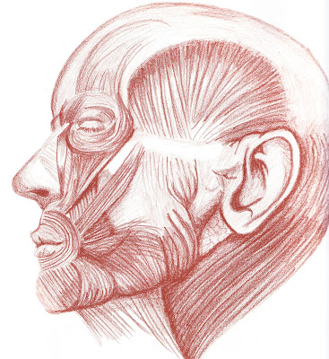
Keep up the great work art students! (P.S. - this is my drawing of the muscles of the head I "had" to do in figure drawing class. Thank goodness I got the opportunity to try this! The abilities I "didn't know" I had helped to increase my excitement about art!

Saturday, October 18, 2008

Art and Stress

I love teaching art, but there can be a conflict in that there is no time for ME to make art! Ay carumba!! Now, if you love making art, you know that NOT making art can be super stressful. There's a need to release those creative ideas, but more importantly, during the art making process, your brain switches into a neutral zone and stress seems to vanish.

I teach in the Dallas Independent School District, and the last month has been very stressful. Our district was over budget last year and this millions and millions of dollars. The solution reached was to lay off hundreds of people in the school district - administration, teachers, counselors - the fickle finger of fate reaches into unexpected corners. We lost our new counselor this week, Mr. Villa, and though he was with us a short time, we are sorry he fell victim to the RIF.

With everything going on in the national financial scene, my own general anxiety level has been high AND I have felt like I've been living in parallel universes between national and local school district emergencies. Time to make some art. I decided to make the project that my AP Studio classes are doing - a design project using geometric shape to explore pattern and design. Oh, joy! It was fun and healing. I highly recommend it! Check out the link in the title of this post to find out more about do-it-yourself art therapy!

Wednesday, October 15, 2008

Student Work - AP 2D Studio Art


The last project of the six weeks was a still life drawing. I love setting this up. I've invested in several different masks that are worked in with other objects (the usual pillows, bottles, baskets, etc.) for exciting focal points. Navi Dhaliwal's drawing is featured because of what he wrote on his critique sheet. He was concerned that in drawing the objects, he gave them his own twist instead of portraying them totally realistically. But, he said, he liked his drawing that way and so did I. It's tricky business drawing from life. Sometimes the most faithful portrayal can be made, but it loses the spark of the individual artist. I think it is more exciting for the viewer to see the objects through the artist's lens...dynamic and personal.

Sunday, September 28, 2008

Redneck Art made with BBQ Ribs

Ha! William sent me this great link for another food art blog entry.....BBQ sauce! The You Tube video is fun....I wasn't sure where they were going for a bit, but then it all started coming together. This would be a monochromatic painting, using tints and shades of the same hue, art students!

Saturday, September 27, 2008

Student Work - AP 2D Studio Art

We have started a new year in Studio Art and I am starting a new feature...I will highlight student's artwork from my class so you can see what we are up to. This assignment was to create a composition using letters and numbers. Janeth chose to spin off Picasso's "The Old Guitarist" from his blue period. This period was between 1901 and 1904 and was characteristic of monochromatic color work. Janeth has created a very successful solution, using the tints and shades of blue in the letters to create the modeling of the figure. Great work! Oh, and check out this site to learn more about his blue period!

Sunday, September 21, 2008

Artist of the Week: Jean-Luc Cornec

Jean-Luc Cornec created this exhibit for the Museum für Kommunikation Frankfurt in 2006. These images flew around the web and got to me through my affiliation with the Dallas Handweavers and Spinners Guild. That group loves sheep! In fact, many years ago I collected images of sheep...such docile and comforting animals they are. Making art out of recycled materials is great on so many levels; it's totally clever - you have to scrounge, but don't have to buy fancy, expensive art materials - it's fun making something wonderful out of cast-offs - it brings the public's awareness to "stuff" and the issues we have with disposing of our "stuff" - and it really shows the creative spirit in all of it's glory! The link in the title takes you to a post by Doug that is a fabulous treatise on this particular installation as well as the importance of recycled art. Be sure to read his post!

Saturday, September 13, 2008

Artist of the Week - Mario Mariotti

The post title link will take you to several images of the fantastic ingenuity of the late Mario Mariotti, an artist from Florence, Italy. Knowledge is so important, but creative thinking is invaluable in all walks of life. His work is evidence that there is creative potential in things that are common, everyday and right under our noses!

Saturday, September 06, 2008

08/09 Academic Decathlon Image #1

Metropolitan Cathedral (Art during the Colonial Era)

This cathedral in Mexico City (also known as Catedral de Mexico) was built by Claudio de Arciniega and others, 1573–1817. Hernán Cortés (the conqueror) destroyed Aztec temples that were on this land and ordered the construction of a Catholic church built on the same site. The cathederal was built to look like those in Spain. Watch this short YouTube video - be there now! You can get more detailed information from this Wikipedia page.

Monday, September 01, 2008

I LOVE MY BLOG! I got a communication from a teacher of art classes for grades 6-7-8 at Chester Academy in Chester NH that was interested in being epals with me!

Judy Krassowski sent me this question to respond to, "This week 8-1 Art is working on a 10-figure pattern/linear or radial collage that features their colored pencil drawings of wooden figure models that incorporate pattern to enhance shape and form (we'll be posting all classworks on Artsonia in the next few weeks). From this project, we utilize classroom students as live figure models for a watercolor experiment and then (AND THEN!) we begin our charcoal (with a bit of eye color) self portraits! What advice do your students have for creating artworks of people whom you know?"

I can't wait to see your projects! They sound really interesting. Soooooo....what advice do I have? It's so simple and so hard at the same time, and your teacher may have said this to you before, but it bears repeating. Develop the way you SEE things! Many art students draw what they THINK they see, not what they actually see! Example - when drawing a person, we usually draw what we think the head (or feet, or hands) looks like instead of looking at the actual lines that are formed by objects. Notice what kind of lines are created in objects - straight, wavy, angled, so many kinds of lines. So LOOK while you draw and don't take your eye off your subject. The more you draw what you see, the better your drawings will become. Oh, and let me know how my advice works out for you! Send me a comment when you work on your projects! Good luck!

Ms. Miller

Sunday, August 17, 2008

Artist of the Week - Banksy

Graffiti can be a controversial subject. Before I went to Rome this summer, people told me how ugly it was because of all of the graffiti there is in the city - well, there were some sections of Rome that DID have a lot of graffiti. Certainly the largest issue is that of personal property...would YOU want someone painting stuff on something you paid for and owned? Probably not. But it can't be denied that it is an art form that lives on and is very dynamic.
Banksy is a British artist that takes graffiti to a new level...check out his website. What makes his art so interesting to me is the juxtaposition of imagery with political ideas. This image shows two young children with traditional beach toys, yet the trees seem to have been blown over by some terrible storm. The additional contrast of color with grey tones adds to the tension in his image. Fascinating guy.....oh, and he pulls some pretty funny art pranks you can see on his site....check out the video links!

Monday, May 19, 2008

Apple Logo Fosters Creativity

I saw reference to this article on another blog - visual exposure to the Apple logo can cause more creative thought as stated in ScienceDaily (Mar. 30, 2008). In a Duke University study, students were briefly flashed with the Apple and IBM logos - subliminally. Each group was asked to list uses for a brick outside of building a wall, and the group that had exposure to the Apple logo had more creative and unusual uses listed. A great example of visual culture and how branding affects us on a subconscious level. Fascinating stuff; I have been talking to my students about the impact of visual culture in their everyday lives for some time now. I am a recent convert to the Mac, iLife and all that that entails. Just yesterday, I put my own Apple logo decal on the back window of my Beetle (how cosmic that I just saw this article!) and I have my own testimonial...I am definitely thinking more creatively since I got my MacBook!

Friday, April 25, 2008

Where have I gone?

Months have passed.....sometimes I say that it feels like I am hurtling through the space/time continuum. Teaching, a heart surgery and a conference would be the explanation for the absence. I love my blog and hope you, the viewer find enjoyment! Let me know what you think!